SOUTHWEST

Responsive set of flows using the company’s existing UI.

Team

Project Mentor &
Peers

My Role

End-to-end
UX/UI Designer

Tools

Figma, FigJam &
Optimal Workshop

Timeline

80-Hour
Solo Project

Project Background & Key Features

Over half of travel bookings are done on devices other than desktop. As a result, Southwest have asked me to create a responsive design for their existing travel site.
  • Book a flight/travel (including the checkout process) as well as a pre-flight check-in process.
  • Display of promotions or featured fares on the homepage.
  • The MVP should include the searching, booking, and online check-in experiences.
DISCOVER

METHODOLOGY

  • User Test/Interview
  • Competitve Analysis

OBJECTIVE

Create responsive flows for the search, booking & online check-in pages.*

Most importantly, the mobile web experience must function well.**

A nice-to-have feature is a real-time notification solution, such as departure delays and any changes.

CHALLENGES

Return customers & potential customers should be able to easily navigate & find what they are looking for on any device. Large ticket purchases should have an easy checkout process.

SOLUTION

The user will have access to great flight deals that are easy to purchase on any given device.

User Interview's

User interview’s were conducted to get a general idea how user’s search and purchase plane tickets, the devices used for this activity and corresponding pain points. Along with the interview, user’s were tasked with navigating the currently Southwest mobile site to decipher what was and wasn’t working.

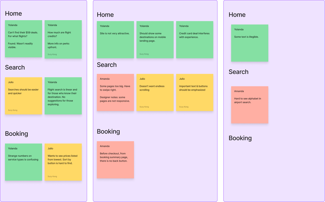
Affinity Mapping of Usability Test

The key takeaway was the user experience on differing devices were all different. Some sections weren’t responsive at all and some accessibility issues were mentioned.

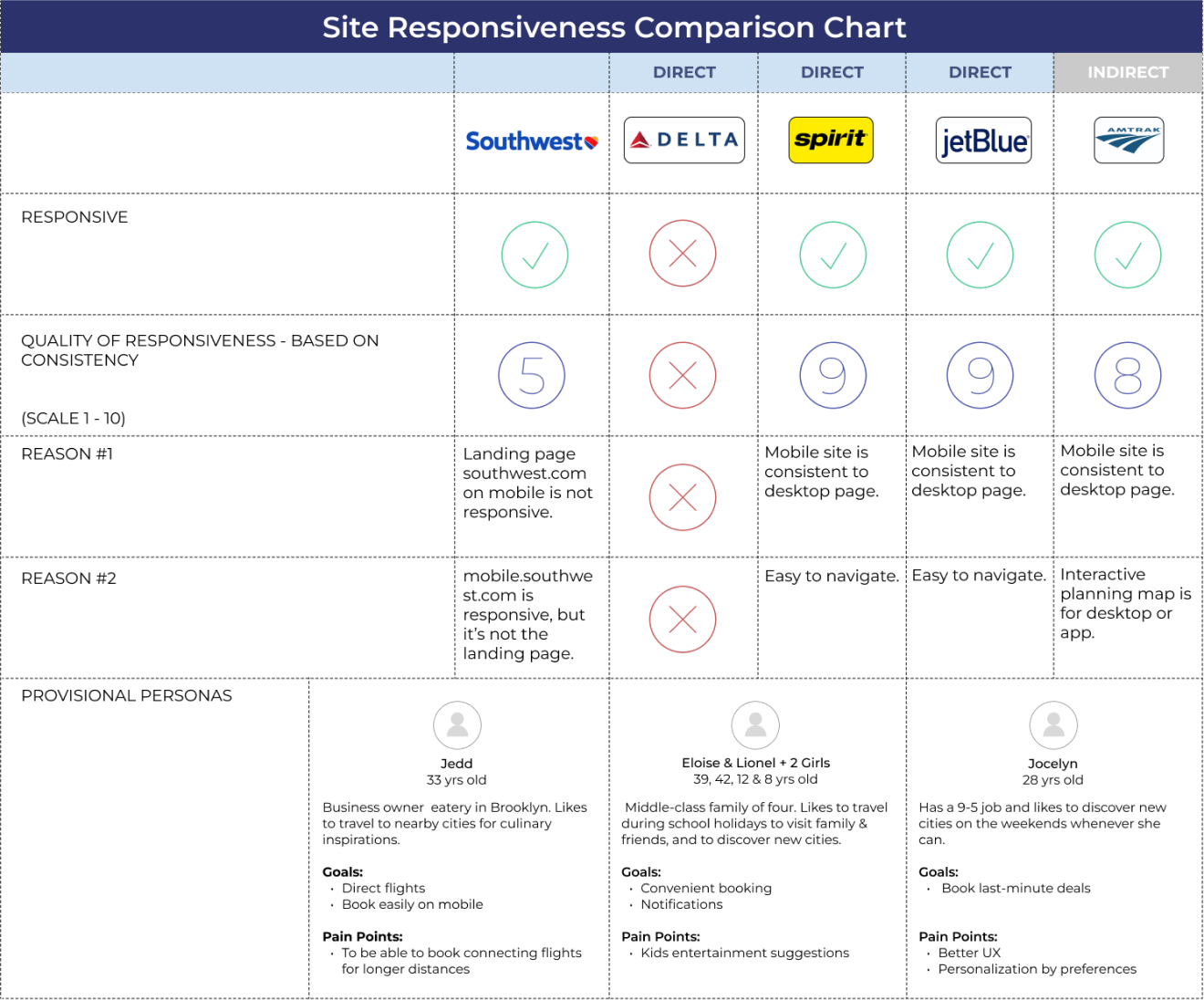
Competitive Analysis

I wanted to know the responsiveness of the competitor’s sites mainly to see how they solved similar problems. Important to note: Responsiveness of these sites may have changed since.

Insights from Research

There was a lot of feedback from user testing, but not all pertaining to the responsiveness. Secondary research revealed site abandonment is highest in the air travel industry. According to Business Insider,

More than 25% of all people book travel through mobile devices, and that number is on the rise.
DEFINE

METHODOLOGY

  • POV & HMW Statement

OBJECTIVE

Now that I have an idea of the responsiveness of the competitor’s site, how they solved similar problems and how consistent their sites are, I now know what needs to be solved.

Opportunity

POV Statement

I’d like to explore ways to help Southwests’ mobile site users have a great user experience by improving the responsiveness because mobile phone usage is ever increasing and it will prevent users from becoming frustrated, especially when travelling.

HMW Statement

The key takeaway was the user experience on differing devices were all different. Some sections weren’t responsive at all and some accessibility issues were mentioned.
IDEATE

METHODOLOGY

  • Information Architecture
  • Card Sorting

OBJECTIVE

Now that I have a clear solution, I can start to ideate on possible solutions. This would be the time to think about what kind of features the product will have and prioritize them.

I will also need to come up with how the information will be structured. What kind of sections, categories and pages the product will have and the naming convention.

Information Architecture

The user flow shows how a visitor will navigate the site by searching for a flight, booking a flight and purchasing.

User Flow

Task Flow

PROTOTYPE

METHODOLOGY

  • Branding
  • Style Guide
  • Low Fidelity Wireframes
  • High Fidelity Wireframes

OBJECTIVE

Using the existing brand & elements, I created responsive desktop, tablet and mobile wireframes of the search, booking and check-in pages.

UI Branding & Style Guide

Using Southwests' existing brand & style guide, I put together a quick guide of the colors and & elements used for the responsive pages.

Wireframes

Low Fidelity Wireframes

These are the lo-fi wireframes for Southwests’ search, booking & check-in pages.

High Fidelity Wireframes

The design should have a consistent look and feel. The calendar format is preserved on all devices.
EVALUATE

METHODOLOGY

  • Usability Testing
  • Impact-Effort Matrix

OBJECTIVE

What is the user experience when searching, booking and checking-in on mobile & tablet devices.

Usability Test & Results

Task

Participants were asked to search, book & navigate to the purchase form and give feedback throughout the process.

Impact-Effort Matrix

Iteration

Usability test revealed some user issues. Iterations were made accordingly.

Conclusion

Executed

Responsive pages for Southwests' search, booking & check-in pages.

Trials

Low fare calendar on mobile works, but could be better adapted.

Learned

Many user's still prefer to buy large ticket items on desktop because they feel they have a better overview and will make less mistakes.

Next...

I will explore improved ways for user's to view flight date ranges and prices for mobile.

Outcome

Overall, a good design challenge. A lot learned. Attempting to include all the information for all devices and keep the experience consistent while making it accessible and uncluttered was a good exercise.

Future Considerations

I think the calendar could have been more intuitive by offering more viewing options with a minimalistic design. I would have liked to have had a bit more time to explore more options, but with the time constraints, that wasn’t possible.
TEEN CHEF
FITBIT
Copyright © 2023 Suzy Kong